How to design visuals to communicate research – a Q&A with Gaius J Augustus
Gaius J Augustus, describes himself as a “well-rounded” scientist and artist who loves to integrate fields. We were delighted he joined our citizen scientists this week to share some of his design secrets with us, along with some resources put together with PSG in mind:

Gaius Augustus: My name is Gaius Augustus, and I’m a visual storyteller and scientist. I started drawing when I was a kid, and actually went to an art magnet school for middle school and high school. After that, I went to an arts university, where I focused on video production.
I went back to uni a few years later to get my BSc in Integrative Studies (Chemistry & Biology), and then went on to a PhD program in Arizona. That’s where I am now, almost done with my PhD in Cancer Biology.
But I love art, so about a couple of years ago, I started to make sciencey art. I put together my design skills and my science skills and started making infographics.
For about a year, I worked for the University of Arizona Cancer Center to make infographics for their press releases and publications and LOVED IT. I’m hoping to get full time work or move to doing science art freelance.
I’m looking forward to your questions, and I’m sure there’s a lot I can learn from you, too!
How much can you use software for data visualisation even if you have no inherent artistic skills?
Gaius: You can def use software (like Canva) to generate data viz for you, but the “artistic skill” is actually the key to making it beautiful.
But you’d be surprised what you can do with just a little help!
Choose a color palette from Pinterest. Grab icons or assets from Creative Market. Use simple shapes! Even just those little things can improve your infographics drastically!
PSG A: So a colour palette would be shades of one colour and/or complementary colours, right?
Gaius: Not necessarily. Here’s my color palette pinterest board XD.
Is the software that you use easily available? Any recommendations?
PSG C: Thank you for being here. Looking forward to discovering how you make your work look so beautiful!
- Free: Canva, GIMP, Inkscape
- Cheap: Affinity Designer
- What I use: Adobe Creative Cloud (Illustrator/Photoshop)
Also have a list of tools in this thread:
PSG D: Love canva!
Where do you start when drawing an infographic?
Gaius: I have a formula.
- What’s the overall message?
- What background info is necessary before I can show any data?
- What title will get someone’s attention?
- What data is 100% necessary to tell my message? What info can I take out? I want it to be concise but informative!
How do you pick out the narrative in the work before you create the visuals?
Gaius: Narratives tell themselves. Ask yourself, what was the original question the scientist was trying to answer? That’s the background. Then ask, what was the conclusion? That’s the end. Then you can work in the details of the story.?
PSG F: How about the intended audience? Or do you try and write on plain English to suit everyone?
Gaius: You have to consider your audience! I choose my language carefully based on the audience. For example, a general audience person may or may not understand how genes work, but a doctor definitely would!
How should we start thinking about how to turn our results into visuals?
PSG G:As you know, we have 8 groups and we’ve all been running our own research. Most of us haven’t got any formal design training (with some notable exceptions) although between us we have lots of creativity!
Gaius: I like to think of it as a story. That gets people engaged more quickly. Then they WANT to look at the data!
PSG I: I’m really excited to see this work unfold, I think it’s so important to work out what are the key take home messages and then communicate them in ways that makes sense to people and makes a quick impact – infographics done well really can do this! Glad we are going to be doing it!
A few years ago, pecha kucha was all the rage for presentations. Does this style have any virtues?
PSG G:What’s Pecha Kucha?
PSG E: You do 20 slides and show them for 20 seconds each. Keeps presentations short and to the point. (I think)
Gaius Augustus: no virtues at all!! # of slides doesn’t matter. Telling the story in an engaging manner is all that counts. You might only need 1 slide. You might need 20.
PSG J: I’m really loving prezi! It’s taken the idea of slides and turned it into something else! Really engaging for presentations.
PSG H: Prezi makes me feel motion sick
PSG C:Powtoon is good …
PSG J: I got carried away with it when I tried it last year and had to reign myself in – can definitely go overboard with the zooming.
Gaius: I love Prezi! But I think you have to use it wisely. Some people just take things too far XD
Who responds to visuals best?
PSG K: Is there a certain type to be used to specific targets, or specific info for dissemination?
Gaius: People without visual problems. We EVOLVED to see color and motion. We respond to great branding and beautiful visuals because we’re built to. If it isn’t reaching your audience, you might just be designing for the wrong audience.
Think about who the audience is and what they care about. Choose colors, images, etc that will resonate with them. But always choose visual mediums when possible.
PSG K: Is it a good idea to look at other marketing to our audience and consider the effect it has on us, maybe? Pick out what works for us?
Gaius Augustus YES! Marketing depts have huge budgets for just this reason! If you can learn from what they’re doing, that’s great. 🙂
What do you usually do to check whether your infographic conveys the message you want?
PSG A: Do you ever ask others what it means to them? Sometimes I see infographics which are really difficult or not quick to interpret so wondering if they get ‘tested’ or what you’d say would be ‘best practice’?
Gaius: I am typically working directly with a collaborator. But when I’m not, I will leave my work alone after I’m done with it for about a week.
If I come back and have to WORK to read it or if the message isn’t obvious, I know I didn’t do it right.
And sometimes I grab my partner and ask for their advice ?
What’s the ideal amount of info for an infographic?
PSG D: One bit of info? 3? 5? As many as we like?
PSG K: Oh good question
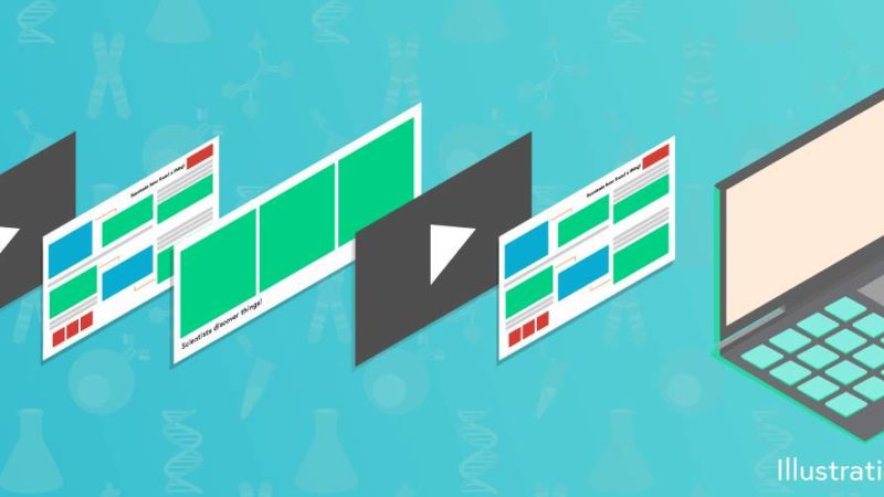
Gaius: I say 1 infographic tells 1 story and has 1 main message. If you need a few pieces of data to get there, that’s fine (see attached)!
Just only include the info you need!
PSG D: So if 1 infographic = 1 story and we have a lot of stories to tell from 1 piece of research (thinking specifically of where we did thematic analysis) is it a good idea to have some kind of unifying structure / colour code / don’t so people know it’s part of the same project? Or does that desensitize people and make them think they’ve seen the info before?
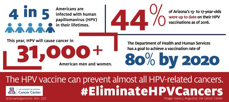
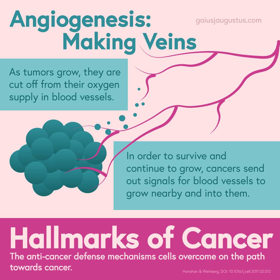
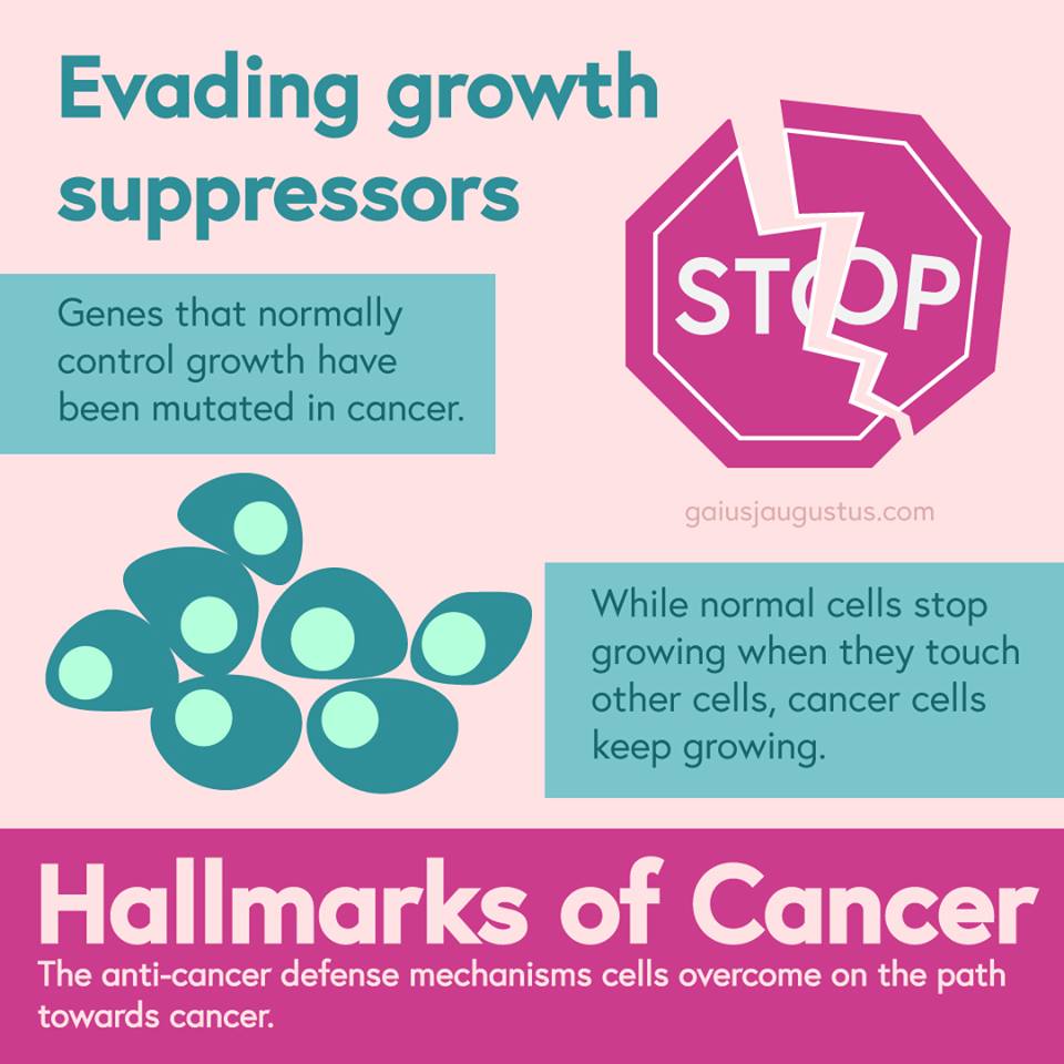
Gaius: That’s exactly what I did for my “Hallmarks of Cancer” series:

Can you have one infographic for all audiences or is it best to tailor for each audience?
PSG L: eg. Parents v. Health professionals?
Gaius: There’s no such thing as a universal graphic for everyone. Unfortunately, you have to consider your audience!
How do you decide what will do well with your audience?
Gaius: That’s a good question. I’m not sure. I’m pretty empathetic, which helps. I also sometimes Google and see what kind of things come up.
And if I have friends in the audience, I’ll ask them?
Oh, and of course, trial and error ?
Sorry, I wish I had a better answer
PSG M: I wondered this too. Eg if I’m trying to communicate to an audience I’m not part of, how do I know what colours/graphic styles/etc they will like? Especially without stereotyping or patronising them?
PSG K: I asked that, whether we should scout our info graphics etc that already exist for our targets and see what clicks
Gaius: Marketing trends can be incredibly useful, if you can follow them
For example, you can look up products for your audience and see what kinds of styles are being used (modern? fun? childish?)
There are also good posts on Pinterest about “color psychology”, so I use those sometimes when I’m lost
PSG M: TBH though I find a lot of stuff marketed at mums is patronising AF…
PSG L: Still sells with many.
Gaius if you have any of these links to hand, can you pls share here? Thanks
Gaius: I typically use Pinterest to save ideas:
I agree things can become patronizing for parents (and for millenials, and other groups). It’s a balance, but if you’re thinking about it, you’re ahead of many marketers XD
Do you have an all time favourite infographic? If so, what do you love about it?
Gaius: Here’s my favorite that I’ve made!
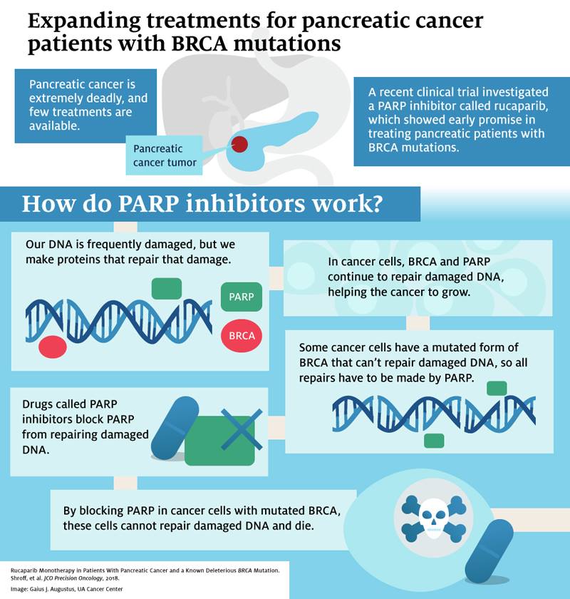
I like it because the paper was REALLY boring and data heavy, but I think the infographic is beautiful and tells an important message (why the researchers thought the drug would work)
PSG L: Definitely eye catching. Could something like this be done on a freeware?
Gaius: YES! The limitation might be in the output quality, but you could definitely draw this in freeware.
PSG N: I love how it leads the reader through the graphic.
Perhaps we should have one about the up to 42% reduction in cancer risk for women with BRAC1 who breastfeed for 1 year and up to 60% for 2 years. That would be powerful, especially in an age of social media where infographics are so useful.
PSG O: parp! ?
What are your top tips to ensure that you are not misrepresenting data?
PSG M: Ooo, good question.
Gaius:
- Always show the axes honestly. Don’t stretch or break up the axes to prove a point.
- Double check your interpretations! For example, “failed to show that our hypothesis was true” does not necessarily mean that the hypothesis is wrong. There are lots of language oddities when speaking “science” XD
- Taking things out of the context of the study is dangerous. For example, if a study was only done in males, it’s dangerous to say that the answers are the same in females.
PSG O: Again – all good science!
Gaius: haha, pretty much. Although some scientists I know could learn a few things about data misrepresentation XD
I’ve been thinking of going on a course. Do you think it would be worth the money?
PSG H: I;m looking at this one: Data visualisation: A one-day workshop | Adam Frost & Tobias Frost
Gaius: Not to toot my own horn, but I’m going to be creating online workshops that are actually affordable to regular people.
I have one coming up (registration is open now) for designing infographics. It’s $30.
PSG P: Sounds like good value!
PSG L: Can you please share a link to it here? Thanks
Gaius: From Science to Infographic Online Workshop (April 6-7, 2019)
PSG H: I am away those dates – will there be more of them?
Gaius: If this one is successful, I’ll definitely be running another one!
You’ve said to think of the story you want to tell. But have you got any tips for actually working out what that is and narrowing it down?
PSG M: I’m thinking of some of our research in particular, where we’ve done thematic analysis and there just seems a lot to say about what we found out!
Gaius: You don’t have to tell the entire story in one graphic.
I start with the my formula (pasted from another Q)
- What’s the overall message?
- What background info is necessary before I can show any data
- What title will get someone’s attention
- What data is 100% necessary to tell my message? What info can I take out? I want it to be concise but informative!
But I definitely believe in 1 message per infographic (not 1 data point, just one overall message)
People tend to get caught up on the data, when the point is the message! The data supports the message!
PSG K: Oh. Good point. Hadn’t thought about the distinction
PSG O: Agh – brain broken :/ twisting my mind with that one lol
Do you have any …
tips for designing graphics for healthcare professionals?
Gaius:
- Show data (duh?)
- Focus on health outcomes (mortality, life quality)
- Use visuals that feature a human touch (example: person’s face)
- Don’t overwhelm with data! (1-2 points if possible)
PSG G:That’s great advice, thank you!
tips for designing graphics for scientists ?
- Give numbers (not just “more people did this”)
- Make sure graphics are accurate (I have funny stories about scientist frustrations with inaccurate graphics)
- Focus on how the data leads to the interpretation! Ask yourself, is there a loophole to this data?
tips for designing graphics for parents?
Y’all would know better than me. ?
But I would:
- include images/graphics of children
- focus heavily on imagery, less on hard numbers
- Make sure the message is very clear and very large.
PSG M: These are super-useful!
tips for communicating to policy makers?
Gaius: Policy makers are so hard! Here in the US, they don’t seem very data driven.
But I STILL think we should show them data.
Focus on the message, big and loud. Then give them ONE hardcore awesome piece of data that screams that the message is important.
How would you show emotions?
PSG Q: Like “we like to be heard by the health specialist”.
Gaius: Emotion is important! I think sharing the emotion should be a priority (through color and imagery), but it has to be supported by data.
Emotion can be conveyed through tone (of the text or color palette) or through imagery (actual images used), and of course through message (how is this affecting the people it is affecting? why is it so important?)
PSG G: Or, NO ONE IS LISTENING TO MOTHERS ABOUT THEIR OWN HEALTH NEEDS COULD YOU PLEASE JUST LISTEN YOU MAY JUST FIND WE HAVE THE ANSWERS!!! AND WOMEN & KIDS WILL SUFFER LESS AS A RESULT!
(Sorry, was I shouting?! 😉 )
How could we get across that this is something mothers feel really strongly about (and, we have the data to back it up)
PSG M: I wish I thought policymakers cared what mothers feel strongly about! I mean, if they did, would they be shutting all the children’s centres and bringing in universal credit?
PSG G: I wish you weren’t right 🙁
However – one of the main message from the breastfeeding advice research is that HCPs need to listen to mothers, really listen, and find out what the issues are.
That message can go direct to HCPs, we can skip the policy makers.
PSG G:At our results Q&A the other day, where our analysts reported on preliminary data from 750 women describing breastfeeding advice they received from health care professionals, much of it was utterly heartbreaking. It was a very engaging but very emotional Q&A.
Do we try to show how passionately mothers feel this, or stick to the data?
Gaius: I have many feelings about how our culture treats women, but that’s another discussion.
Communicating is always hard! All we can do is our best, and act out when we have to!!
PSG Q: Would it be interesting to start putting a woman face in the middle and work around like a clock and 12 o’clock will be happy face with a the right input and 6 o’clock is the unhappy face?
Any thoughts on avoiding stereotypes in infographics?
PSG A: e.g. the most obvious way to display differences in rates of men and women is to put the women in a dress… Is it important to consider stereotypes in infographics?
Gaius: You have to consider stereotypes, but you also need to consider your audience.
For example, I’m non-binary and live in that community. If you showed data for men and women to my community, you’d have pushback.
But for a medical audience, that’s a great way.
Graphics are tough because they’re simplifications, but that also makes them susceptible to be oversimplifications.
I think the best thing you can do is continuously ask yourself if this could potentially be offensive to someone, is there a reasonable way around that, and if so, implement it.
You can’t make everyone happy, but if you consider your audience, you’ll find a middle ground.
PSG A:Same issue with disability.
Gaius: You’re exactly right. This is a problem with all kinds of diversity!
PSG A: I’ve got a real interest in being able to do things like this myself to be a better communicator of my research. So would love to try out some of the ideas from this Q&A.
Where can we get graphics from?
Gaius : There are icons and graphic packs you can purchase from Creative Market, too, if you’re looking for some. I don’t know what all is there, but it’s a good tool I know some of my graphic designer friends use when they don’t want to draw stuff themselves.
PSG L: Thanks very much. They offer free weekly downloads I think. I’ve forgotten about them; thanks for bringing the up here.
How much do you consider Twitter when creating infographics?
PSG A: i.e. do you also make them Twitter readable? Or adapt some to make them good for smaller screens?
Gaius: I design every infographic with a platform in mind. So print vs Instagram vs Twitter. You have to think about this when you’re thinking about audience.
This was for instagram
This was for print
Here’s another example of one for print.
PSG K: Oh that’s so
useful
Gaius: By the way, before I go, I want to share a resource with everyone.
I have a few handouts and worksheets that might help you with your infographics!
Handouts and worksheets for Parenting Science Gang Q&A 3/13/2019 – Gaius J Augustus
Related Links
Gaius Agustus’s website and portfolio
Handouts and resources for this Q&A
Gaius’s colour palette pinterest board
Twitter thread on design tools
Gaius’s course: Science to Infographic Online Workshop (April 6-7, 2019)
You may also like